Wednesday 22 November 2017
Dark Angels Nephilim Jetfighter: TO-DONE!
Hi folks,
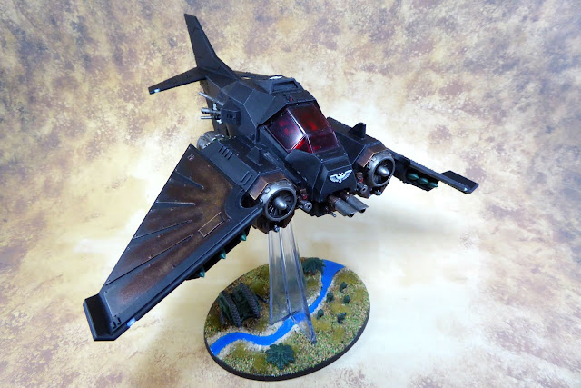
There is something a bit... Batman... about the Nephilim. When I decided to repaint this one I wanted to make it a lot darker than what I was used to seeing, which meant changing the wing colour scheme and the missiles so that it all blends in a bit more with the black fuselage. I think what I have produced is decidedly more grim/dark, but I will let you be the ultimate judge of that.
I have never been a huge fan of flyers in the 40K game. When they were introduced it felt a lot like a game of scissors-paper-rock had turned into scissors-paper-rock-lizard-Spock (and my army had no lizards, or Spocks). I still feel that they are a little misplaced on a 40K gaming table, particularly when other gaming systems have some pretty neat rules for flying units that make more sense (looking at you Battletech: Alpha Strike). To give me the push that I needed, my mates gave me this Nephilim and a Storm Eagle transport, which I split between my Dark Angels and Iron Snakes.
I really enjoyed painting the metallics on those wings, I was really rough with it which felt liberating after all of the detail work on the lenses. One of the last jobs I had to do was the black highlights, which I kept pretty sharp.
I played around with the colours on the engines a little bit, painting some of the internal parts gold with a green wash just for kicks. I like the way that the colours match the base, creating a kind of visual link between the two; I'm weird that way.
I also added a bit of a blue/purple glow to the end of the engine, just to add a bit of light coloured detail to the rear view. Again, the colour ties in nicely with the river on the base, which is a technique I like to use.
As I mentioned last post, my mates added some Epic scale Space Marine figures to the base to establish a bit of forced perspective, to make the flyer look like it was flying higher above the battlefield. I loved the concept to bits, so I added to it a fraction with the addition of a river and some trees, which match my gaming board appearance pretty closely. The effect is great for a display piece, which this model will be for most of the time. Of course when it is next to other models the suspension of belief is a lot harder to maintain. That doesn't bother me too much, flyers shouldn't be pulling such tight maneuvers 20 m off the ground anyway!
Overall, I am very happy with how this project turned out. I think I have made it look a little more sinister, whilst still maintaining the features that my mates worked so hard on. Drum-roll: big orange stamp!
See you across the table,
Marc
Subscribe to:
Post Comments (Atom)


No comments:
Post a Comment